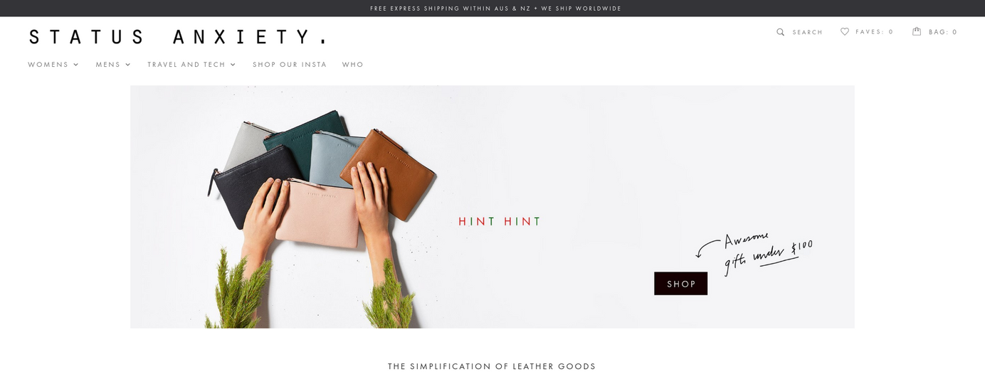
4 Product Placement Secrets to Help You Sell More
Table of Contents
Consumers are completely unaware of many of the subconscious signals that drive them to make a purchase. Here are four smart tricks that store owners can use to increase their conversions and sales.
We all have to make constant judgments about how we deal with the world around us. Often our decision making takes place on a subconscious level, however.

Because of this, systems and processes can be set up to guide people to certain decisions – for example, directing consumers where advertisers and retailers want them to go.
This might mean displaying clear signage to the checkouts (so customers don’t give up and leave) or wafting the smell of fresh bread from an eatery (to lure hungry commuters in). In the online realm, it can mean making it as easy as possible to complete a purchase; or recommending items that the shopper is likely to purchase.
This is something that smart store owners can take advantage of.
And doing so can make an enormous difference to your click-through rates (CTR), your conversion rates and your ability to turn your advertising budget into pure profit. And if you’re able to effectively implement these four strategies then your site will be selling for you without you having to lift a finger.
Knolling
Knolling refers to a style of overhead photography in which items are captured from above, lying at 90 degree angles to one another – and hence making up a grid formation. It’s around 30 years old but has recently come into fashion in the age of Instagram.
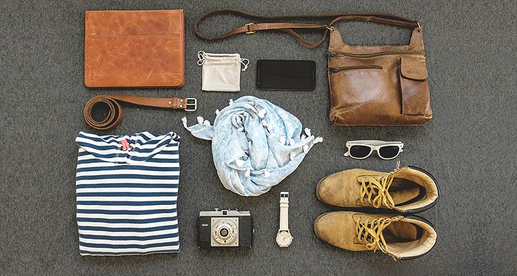
What’s so good about knolling?
Everyone likes good design – and it can be extremely satisfying to see the chaos of everyday life being restructured along orderly lines like an Airfix kit.
While you might lay out a toolkit into a grid, you can also place dissimilar objects alongside one another, for example, putting hiking gear together with rocks and pinecones and thereby associating the items together. This technique can hence be used to flesh out the brand’s wider imagery around its products.

“It's the fascination of the image being something different than a messenger of meaning,” experimental psychologist Johan Wagemans told CNN. “Usually, perception is after meaning, but when you start playing with images in a way like this, it's clear that it's not about meaning, it's about the special relationship between things and how they form a group or a composition.”
Fonts that are harder to read force the individual to exert more mental effort to understand them. In the same way, images that use knolling force the viewer to engage with them in a way that they would not when looking at any of the constituent parts of the picture.
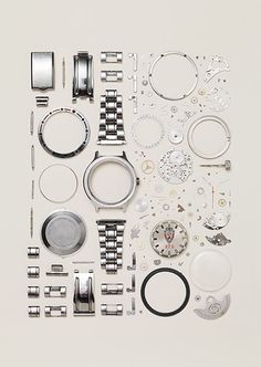
This can hence be a powerful way to focus your customer’s attention and to make a sale.
So what does an ecommerce operator do with this information?
Create your own images using knolling to show off your best products and combine them with items that reinforce your brand identity.
Knolling can also be used to place an item in a specific, appropriate environment – for example, placing a range of pens in a grid on a desktop and hence giving them an appropriate context that the customer can engage with.
Disassembling an item (for example, a watch or a pen) can also illustrate its complexity and the craftwork that has gone into creating it, but which would normally be invisible.
Cut Clutter
There’s a case to be made that the more choices you give people, the more that they’ll buy. However, that’s often not the case – more options simply mean more confusion for the customer and higher overheads for the business.
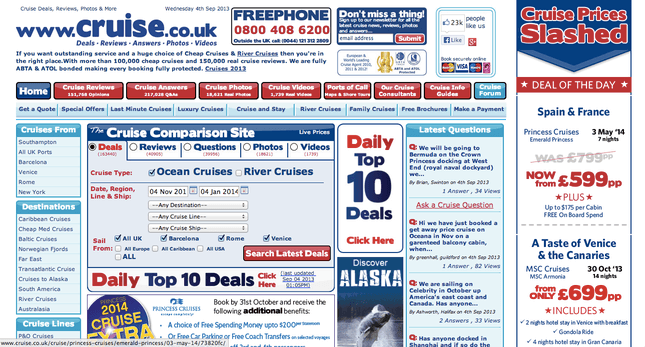
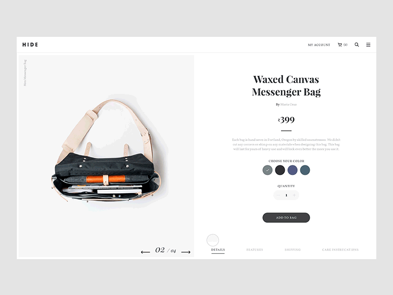
On a website, that’s even more true than in the real world. There are a very limited number of things that you actually want visitors to do, whether it’s buying a product or making an inquiry about a service, so everything else is just noise. If users can click away, then they will – and some will then drop off and never make a purchase. Even just having unnecessary clutter on a landing page will distract some users from your call to action and hence hurt your CTR.
The key thing is to find the ideal combination of elements to direct the user to the desired destination, while giving them the information that they need to make a purchase. Removing the main navigation, for example, can make a major difference to your conversion rate. And once you have your landing page optimized for users then you have everything you need for a scalable business.
Get Organized
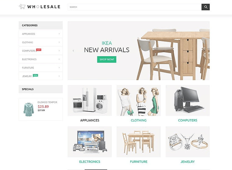
Of course, while you need your users to get to their destination, you also want them to understand your offering. And that’s more about getting your product categories right than controlling the number of individual products that you have available.
In short, you can make everything much easier for the user by breaking up your offering into a manageable number of categories. This means that customers can quickly find what they’re looking for and compare like-for-like products.
It’s also worth keeping in mind that 43% of all US web traffic comes from mobile devices today. This means that it’s essential to have a responsive page that offers an optimized experience for mobile (and it’s important for your SEO to do so, too). If customers can’t use your site then they won’t make a purchase. What’s more, the smaller screen size limits what users can do – and reducing the number of product categories limits the amount of navigation that will be needed.
Use Retargeting
There are two types of people in the world: people who have come to your website and people who haven’t – and the first group are far more likely to be interested in what you have to offer than the second. Given that, retargeting can be a highly effective strategy. What’s more, the stats bear it out: retargeted ads have 10x the CTR of a typical display ad and users are 70% more likely to convert.
Using retargeting is a great way to make your advertising budget work harder and to bring potential customers back to your site.
That said, when customers notice that they’re being followed by targeted messaging it can be uncomfortable for them. One strategy is to use non-specific ads, opening the door for them without stressing that they’re being personally followed.
Opinew Blog Newsletter
Join the newsletter to receive the latest updates in your inbox.


